Creating the Kolodji Brand
The brand began with a name: Kolodji, Taylor Olson’s family name he wanted to pay homage to in his carpentry & construction business. My client had a clear vision of wanting to tie his personal family history into his brand, which focuses on selling his services as a woodworker.
After several hours of mind-mapping, conducting competitor research, and then the sketching and ideation process based on the client’s vision, I came up with this brand identity for him.
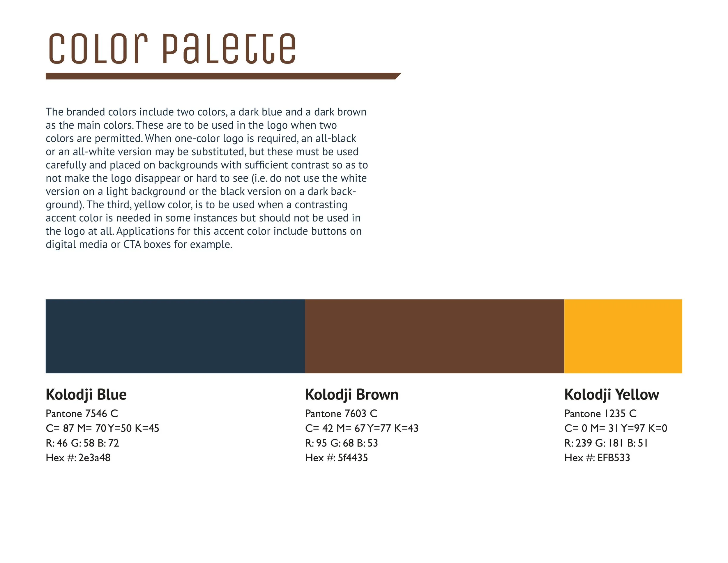
I wanted Kolodji to represent sturdiness, strength, and utilize colors that denote trust and speak to the materials with which Taylor works.
Several angular cuts into the logomark tie into the geometry and angles that no woodworking project can be completed without. A bold, thick sans serif font further underscores that sturdiness.
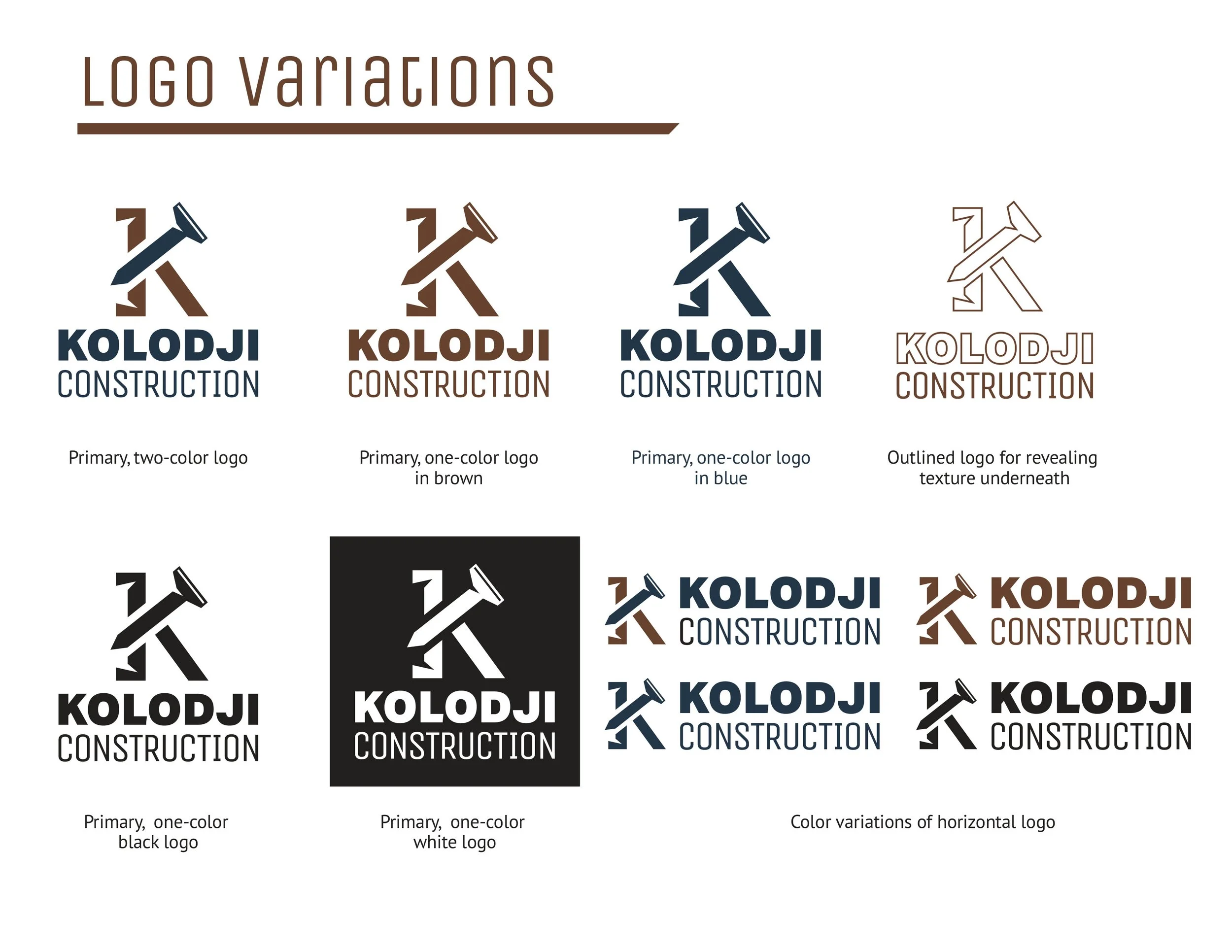
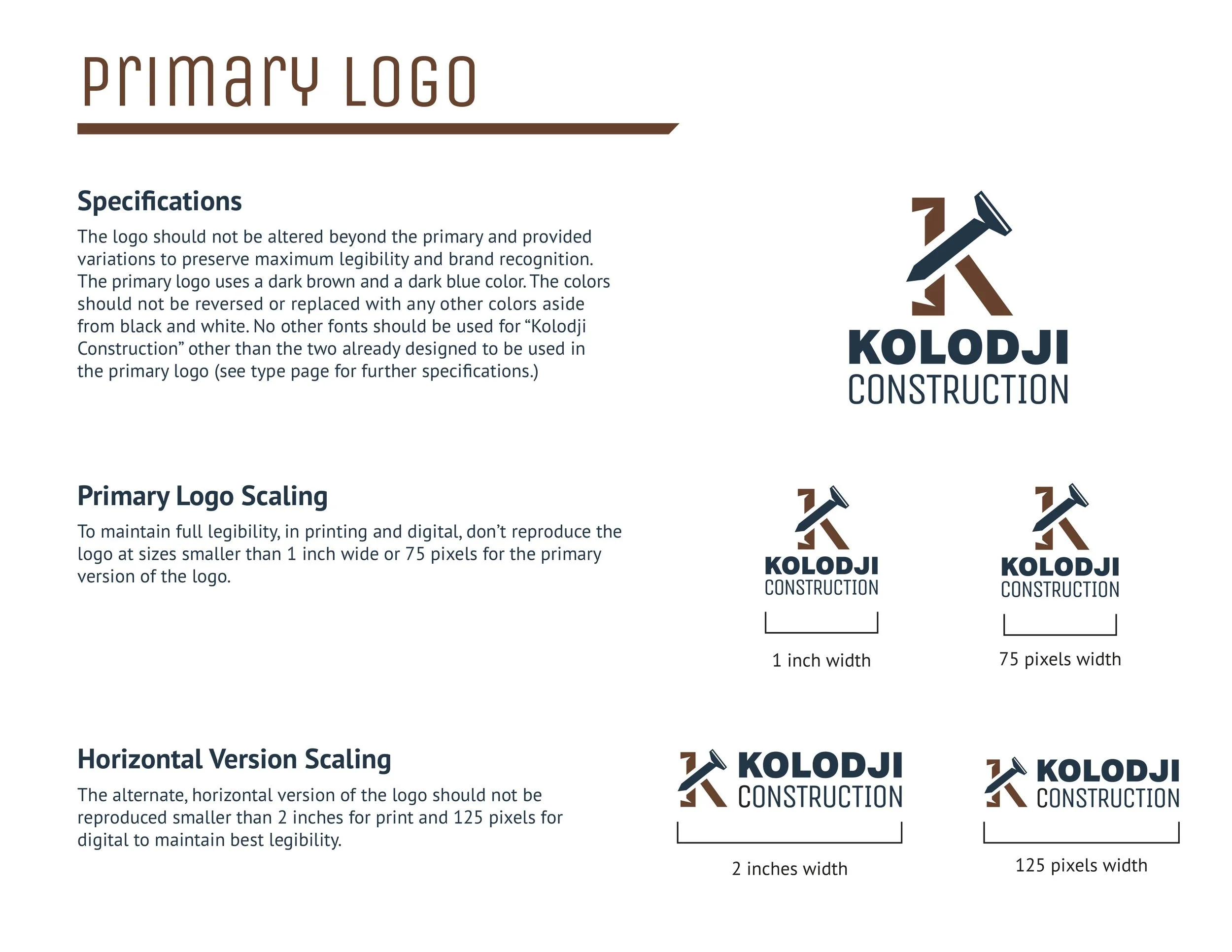
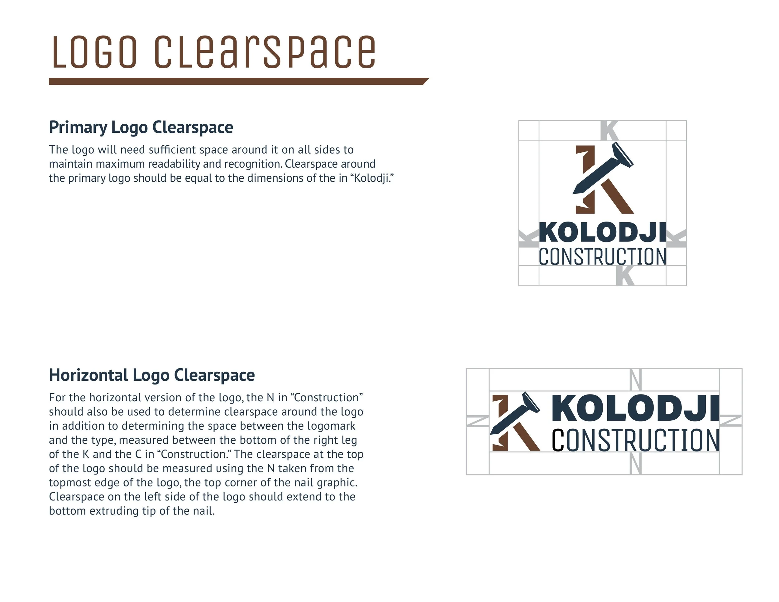
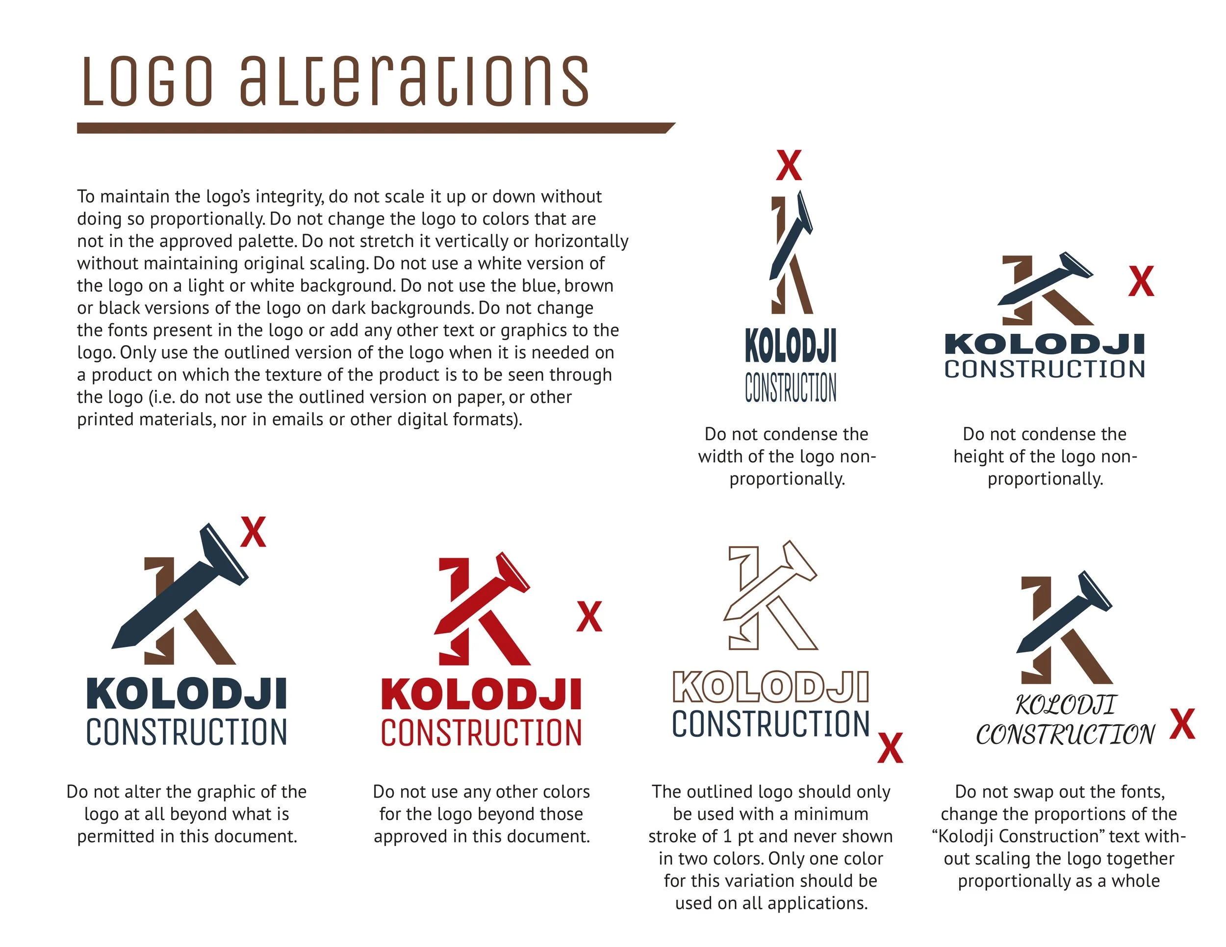
Two variations on the logotype including a vertical and horizontal format, as well as single-color, black, and knockout versions. I prepared a
full brand guide for his use as well.
The client was pleased with the outcome and has since applied it to merch, a truck wrapping, and more and has seen growth in his business ever since our collaboration together.
